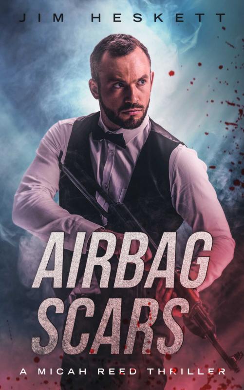
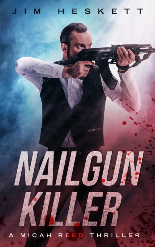
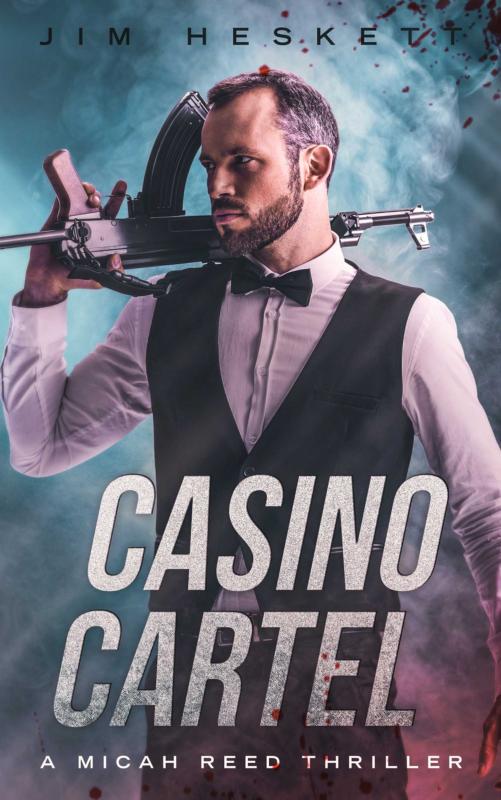
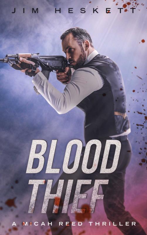
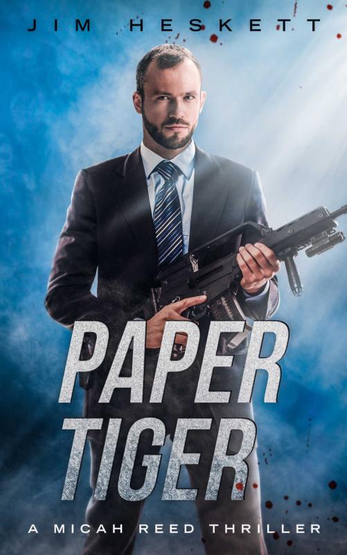
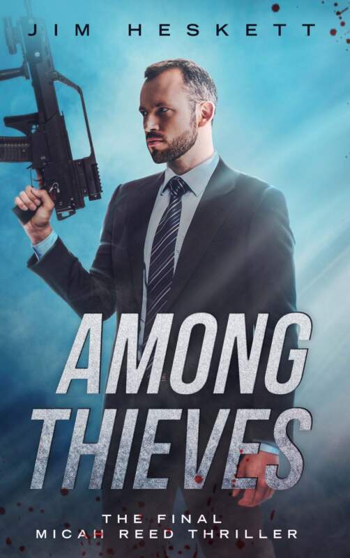
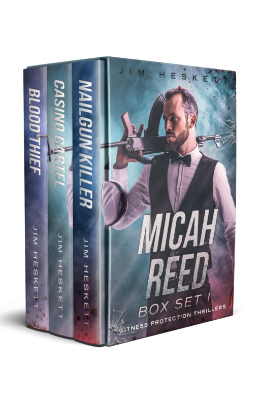
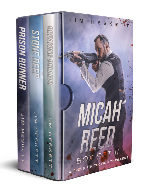
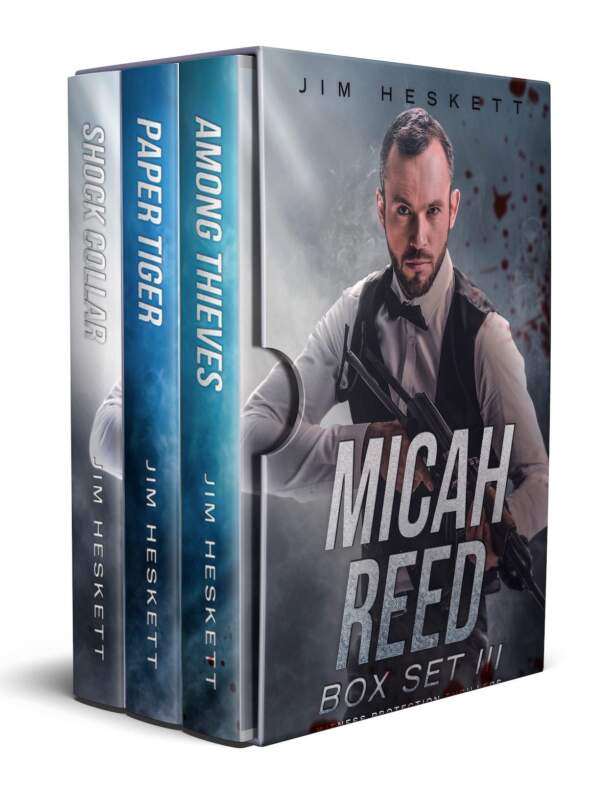
Hello reader friend! Since I began publishing the Micah Reed thriller series way back in 2016, it’s had almost as many different cover variations as it has had books in the series. I’m here today to give you a brief written history of the look of Nailgun Killer, as well as some thoughts on book covers in general, covered below…
Without further ado, let’s talk about book covers.
Nailgun Killer: The Long and Sordid History of the Cover

That right there is like an antique car of book covers. It’s so old, the book doesn’t even have the same name.
I designed it myself because I didn’t have the money to spring for expensive covers. Anyone in the publishing industry will tell you that authors should never make their own book covers, unless they really know what they’re doing. Case in point: not me.
But, it was all I had, so, I did what I could. My art skills have improved a little over the years, but now I mostly know when to let the professionals do their thing…
Then, the covers went through several iterations, all done with varying levels of professional help. Let’s dig in to the smorgasboard of quality:
Nailgun Killer: the cover uncovered: the rebellious teenage years
The next ones in were pretty, changed soon after publication:

And I kept these around for a couple years because they were so pretty. Those artistic plates with the separate images… looking like canvas… it’s a gorgeous cover.
The problem was, the book didn’t sell. Looking at that cover now, it seems suited for a literary crime novel, which Nailgun Killer is not. I’m proud of the book, but it’s definitely closer to pulp than literary, if there’s a sliding scale.
So. wanted to make the covers more action based to reflect the thrillery-ness of the book in early 2018:

Which resulted in this. Yuck, I know. it was a brief and ugly period in that book’s history… but I can’t pretend it never happened.
Moving on…
The Micah Reed series has ten books in it (plus box sets and various novellas and short stories littered about here and there), including the nine books available on Amazon as well as AIRBAG SCARS, the one book that’s only available to my reader group.
With such a lengthy series, redoing all the covers is a costly and time-consuming venture.
I updated the covers again in 2018 and I still wasn’t happy with the results. It still wasn’t quite nailing (get it?) the genre look that really captured the book. Nailgun Killer isn’t an edge-of-your-seat action thriller. It has a slow boil more like an Elmore Leonard novel, and interlocking plot lines that intersect in unexpected ways, escalating tension, all culminating in a breathless fast-paced finish…

And these didn’t quite cut it. I mean, the subtitle emanates from his crotch. That’s just weird, man.
Also please note I’m only poking fun at the covers I designed myself here. I have no intention of shaming anyone else’s work… you can clearly tell which ones were designed by me and superior ones the pros have done…
And so, I set out to remake these covers once again. I commissioned one new cover, and then I put the old Nailgun cover up against the new Nailgun cover and let my Facebook fans vote.
The group members chose the old cover, at about 65% to 35%.

Which I thought was interesting. The red-white-and-blue-guy cover on the left is clearly more pro-looking. It’s a clear, simple, and effective cover, in general. But then…
Some people who chose the old one gave reasons like this:

Because the new cover features a human model where you can clearly see his face. I hadn’t considered that before commissioning the cover.
My Micah, Your Micah
I understand the argument against it. I don’t go into great detail in the books describing Micah’s appearance (aside from being average build, brown eyes, short and messy brown hair), because I want people to picture Micah how they want to see him.
I mean, I have my own image of exactly what Micah looks like, and I’ve never shared that with anyone, because I don’t want to put that specific image in anyone else’s mind.
I long ago ran a facebook poll to see who my readers thought would play Micah in a movie, and one response came back suggesting Clayne Crawford:

I like it. Is that what Micah looks like? Not in my head. Could Clayne play him in a Netflix show? Sure, because my Micah and your Micah don’t have to be the same.
Also, I later recognized that the cover with the machine gun still didn’t quite capture the look I wanted. I can understand now why some readers might have seen a guy with a machine gun and thought it didn’t seem to match Micah’s character. That’s one legit reason why people would have preferred the old cover.
So, I didn’t stop looking…
This version was designed by my friend and author Dave Berens, and I love it. It’s more crime-y than other versions, and although I do like it, there’s still something not quite right.

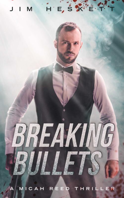
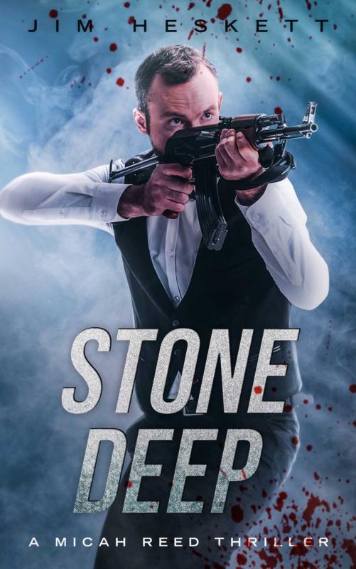
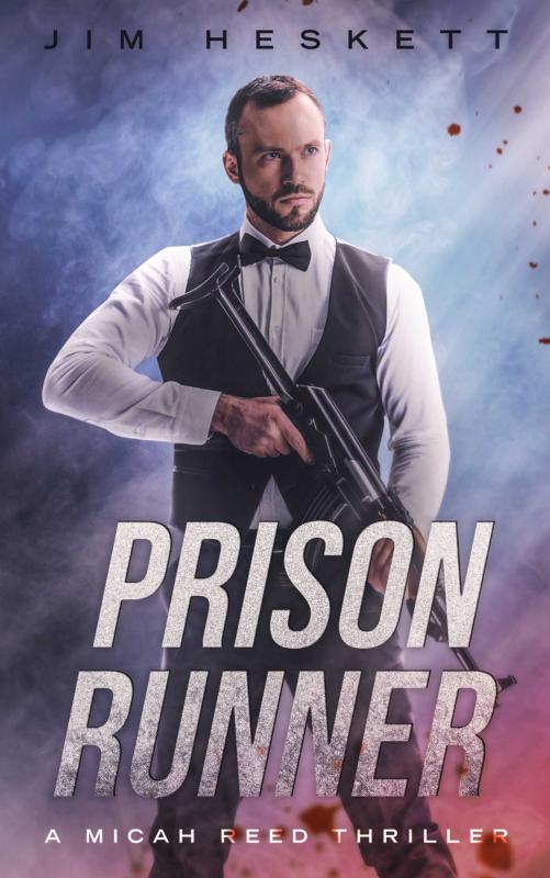
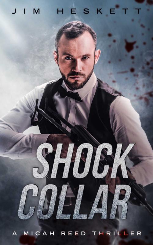
I’ve included the newest version of the covers below. Is that guy on the cover Micah Reed? Yes and no. He represents what Micah Reed is, but he doesn’t have to look like him, not if you don’t want him to.
I love my readers. I love youse guys. You’re the best!
Have a great day!


